For this post, I went to my nearest bookstore (aka Amazon on my computer) and searched through my favorite genre to see what lovely book covers gained my attention. After a very fun search, I came up with three book series. I know I missed lots of amazing covers, so I can't wait to hear about your personal favorites:)
3) The Menagerie series by Tui T. Sutherland and Kari Sutherland.
In fantasy stories, I'm not always the biggest fan of having a character(s) as the main draw on the cover. I want to know what types of creatures and magic are waiting for me within the pages. For this series, the cover gives enough hints of things to expect but still leaving some mystery. I also like the colors:)
Story: 5 stars. Loved them all.
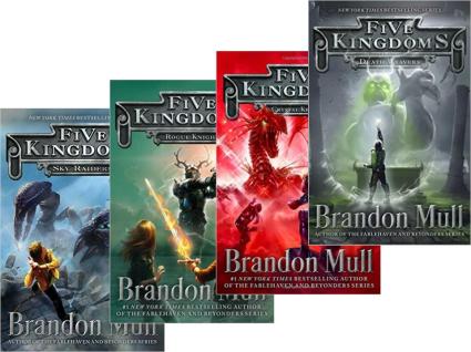
2) Five Kingdoms series by Brandon Mull. Some books, even middle grade/YA book covers can have somewhat childish graphics. These visual ones have a more realistic feel to them. The MC is on the cover, but he isn't the main attraction. We immediately know these stories are full of adventure and monsters.
Story: 4.5 stars. Great series of which I am going to be reading the last one during my spring break.
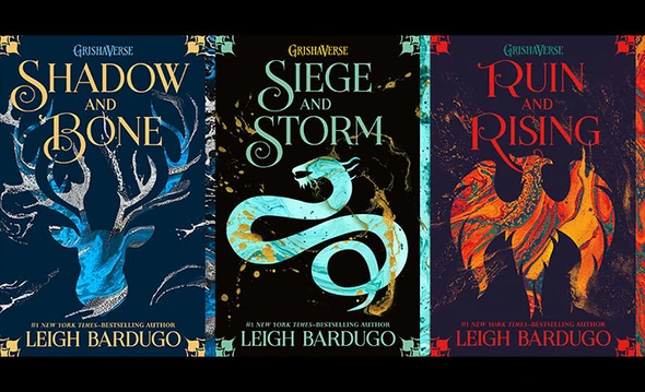
1) The Grisha trilogy by Leigh Bardugo. I haven't actually read these but just stumbled across them in my search on Amazon. Though simpler in appearance than the others, I am intrigued by the animal outlines and especially the colors. I have no idea if I'd like the books or not, but I would certainly flip over to the blurb to see what they were about.
Your turn! Is there a book or a series that has an awesome cover that you love?


Too many! The Tales of the Goldstone Wood series has beautiful covers, which first attracted me to it. Storm Siren by Mary Weber has a striking cover. The Sword and the Staff trilogy by Patrick Carr has great covers. In fact, that's how I got started reading it. I was at the library looking for new science fiction and fantasy books to read for writing research, had picked out a few in the Sci-fi/Fantasy section and was leaving, when a dark green and black spine in the General Fiction section caught my eye. Even from several feet away (too far to distinguish anything on it), something told me the book belonging to that spine was a Bethany House Publishers fantasy. I was right. I checked it out along with the earlier books I'd picked up, but it was the only book that I finished. And now I'm looking forward to reading Patrick Carr's 6th book as soon as it comes out.
ReplyDeleteAwesome! I looked up Storm Siren, and it does have a striking cover!
DeleteI love the Storm Siren series covers -- all gorgeous! And Neil Shusterman's Scythe was visually striking (& the story phenomenal).
ReplyDeleteI do like the Scythe covers! Looking forward to reading the third book too:)
DeleteOoh, these are neat covers! Though I'll admit, my favorites all tend to have a person featured prominently. I love all of Melanie Dickerson's covers and the covers for Lea Doue's Firethorn Chronicles!
ReplyDelete